
While working with clients on a custom Forgotten Postcard of The Sainte Catherine/Sint Katelijne Square and church, I was asked what options I could offer. As with many of my clients, they were worried how the colours of the art would match the decor of their home.
As a commercial photographer first and foremost, I’ve never been a temperamental artist. To me, the best result is a happy client and I’m more than willing to adapt my works to achieve this goal.
For the Sainte Catherine Church Forgotten Postcard, I came up with three options: Full Colour, Warm Sepia Tones and Monochromatic. Below you can see each of these versions:

Full Colour Option

Warm Sepia Tones Option

Monochromatic Option
These three versions are available for all of the Forgotten Postcard series. Contact me for details.
Which is your favourite version? I’d love to hear your comments in the section below.
 Alison Cornford-Matheson is a Canadian photographer living and working in Brussels, Belgium. She specialises in garden and travel lifestyle stock photography. In addition, she is a Photoshop professional and produces digital artwork as fine art prints. Alison is available for assignment work and commissions on request.
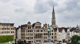
My favourite is the first one as I like the colours showing through more, although all of them look great! 🙂
Thanks! A lot of people seem to like that one best, including the clients, but my favourite is actually the sepia toned one.
I realllllly like the full color one – followed by the sepia version.
Thanks Emily! That seems to be the going consensus 🙂
My favorite is Warm Sepia Tones, followed by Full Color!
You always did have great taste 😉
Hmm, this is a tough choice I’ll pick the color one because I like the hint of blue in the sky, but I like the tones of the sepia one, too. I’d probably just be the difficult client and want the sepia tone church with the blue in the sky from the full color one. 😉
Haha, well Lee, I aim to please so I just might be able to make that happen 🙂